
 |
-
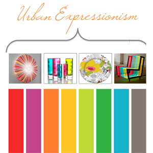
Representing the unrest in today's society, the Urban Expressionism palette combines boisterous hues and quiet neutrals that are no longer strange bedfellows. Image: Sensational Color.
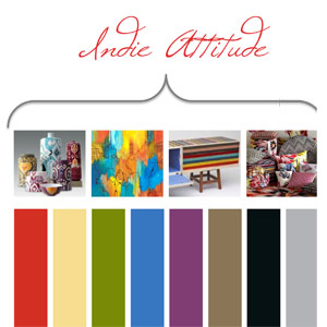
Generation Next and their connection to the digital age has influenced the Indie Attitude palette. Image: Sensational Color.
Generation Next and their connection to the digital age has influenced the Indie Attitude palette. Image: Sensational Color.
More on Design
Want more design trend insights? Watch for these emerging looks:
- Geo Deco: The element of surprise in scale, shape, pattern and color ainspired by pop art and pop culture.
- Second Life: Reclaim it, reinvent it, and reuse it.
- Born to be Wild: Outdoors in and indoors out continues with animal décor.
- Drawing the Line: Artful lines, in stripes, plaids, and patterns.
-
Sensational Color Forecast
A look at the color palette influencing today's home furnishings.
- by Trisha McBride Ferguson
Looking into the future of interior design and home furnishings would be impossible without an expert look at the most influential color and decor trends. Experts in all things color, Kate Smith and Kiki Titterud of Sensational Color have a firm grasp of what we'll be seeing in showrooms, stores and homes for the next 12-24 months. Here's a look at their predictions for the new hues shaping our future.
4 Amazing Palettes
Smith & Titterud have compiled four unique color palettes that capture the spirit of today's color trends, with each palette offering its own story.

Urban Expressionism reflects an inner restlessness that bubbles up from within. We are switching focus; pushing the boundaries of previously respected norms, challenging authority figures, and experimenting with new ways of being. From fighting for justice to accepting a person exactly as they are, this is a grassroots movement that is fueled by a concern for the greater good and celebrities like Lady Gaga. Key influences include: financial crisis, tumbling governments and uncertainty that drive an outcry for change and rebuilding.
These colors acknowledge that designers use scale, color and materials to create an experience that takes us out of everyday reality. The unanticipated quality of these elements catches our attention, evokes surprise or delight, and reminds us that the unexpected isn't always negative. Seeking to regain a sense of control in an out-of-control world—combined with our need to be seen, heard, and accepted—is expressed with highly intense and often clashing colors.
In the home, the movement towards living with less may mean smaller spaces and fewer possessions but it doesn't mean less color. A bold use of color makes a big style statement and replaces the need for extra furnishings to fill a room. Expressive patterns substitute for artwork and a few bright accents go a long way to express personality and mood. The colors in this palette are chromatic, often combined in unexpected ways. Look for these hues to be used in oversized patterns on fabric or rugs to create a statement piece that unifies a scheme of many vibrant colors. These colors are tamed when used in translucent applications and are enhanced when illuminated. In all of the trends you’ll notice that boisterous hues and quiet neutrals are no longer strange bedfellows.


The story behind Indie Attitude is the juxtaposition of simple and self-sustainable in contrast with complex and high-tech—and a world that has us trying to build a life somewhere in between. Our desire to feel safe, secure, and part of a community is counterbalanced by our need to move ahead, express ideas, voice opinions, and be uniquely who we are. This palette's key influences are younger adults who are unwilling to compromise on color, design, or features. They expect that a product doesn't just have one attribute but that it has them all. Growing up in the digital age, young adults are open to highly saturated colors. They also are open to new and unexpected color combinations and they rely on color to express their emotions and sense of style with combinations of bright, fun, hues that are in high contrast to black, white and a wide range of neutrals. Multidimensional colors create awe; unconventional combinations disrupt, shock, and awe.
This palette comes to the home with unlikely color parings, pattern with pattern, and a variety of texture—part of a trend that might have been called modern mashup. Reclaimed pieces mixed with high end, new with old and high-tech with hand-hewn—often all in the same design—give rise to spaces that are as unique as the people that occupy them. Objects from around the world serve as inspiration rather than as accessories or artwork. Neutrals build a solid foundation that balances the strong colors, bold patterns, and eclectic mix of furnishings. Even if you don't love the look, it is hard not to be intrigued by a style that is so very personal yet completely comfortable being simply what it is.


Recapturing a past, idealized as being brighter, happier and easier, seems the perfect antidote for our stress-filled lives. Discovering that joy from careers, possessions and bank accounts can be short-lived, we shift our focus to more meaningful sources of wellbeing, happiness and personal balance. Older generations are learning alongside their children and grandchildren about how to balance complex technology with a simpler approach to living a meaningful life. While the new hipster, eco-aware Generation Next takes the lead on reinventing handmade and homegrown. The mantras that unify all are less is more; quality over quantity, and live authentically. This palette is influenced by a focus on eating local, buying local, being aware of what we put into our bodies and how we interact with the environment.
Colors that are down to earth, or seem vintage or nostalgic appeal to our desire to live a simple, healthy lifestyle. Earthen, washed, hand-dyed hues feel comfortable. These slightly grayed colors are more relaxed, naturally beautiful, and have a genuine feel that works well on its own or with embellishments. Cool colors calm and relax, making blue, green, and purple the go-to hue families; warmer colors provide warmth and balance. In this palette decor can be rustic, retro, or modern. The look is handmade, hand-dyed and organic. It may be created with the latest technology or crafted by hand but the attention to detail and usability is what makes it distinctive. Hand-embellished or constructed items have a nostalgic character that is as comforting as a well-worn quilt. While the details are a retake on tradition, the style is a blend of clean line contemporary, mid-century modern, tag sale antiques, and Hollywood glamour. The result is a space that is fresh, comfortable and feminine without being fussy.

Too much to do, too much to think about and too much stuff has us asking, "Would life be better with less?” Many of us are shedding anything that isn't essential or meaningful and more will follow as living with less becomes seen as "living large." Technology helps make it possible to live with less while enjoying increased mobility, flexibility, and freedom. This will gives us a sense of mental lightness that we will want to mirror in physical space. This palette is influenced by a more streamlined life that calls for design that employs modern technology and materials to make our complex lives easier or at least seem easier. Eco-friendly materials are assumed, but that isn't enough. Functionality, design, color, durability, and savings will all have to be superior is over. We want a healthy home that is our safe haven.
These colors are neutrals that play perfectly to both a more streamlined life and high-tech style. They are masters of functionality, play well with form, take on a texture and flirt with a variety of finishes. The neutrals in this year's palette are complex enough to hold our attention while being quiet enough to give our eye and mind a place to rest and decompress. The nuances of colors in nature are inspiration for a range of neutrals. From tones as subtle as driftwood to those as rich as dark loam these hues find their way straight out of the natural environment and into our home. We'll see neutrals generally going warmer with even the purple-based grays leaning slightly red. Layering these monochromatic neutrals with pattern, texture, and materials brings interest without necessitating accent colors.
