
Without question, the economy and everyone’s preoccupation with preserving their homes, lifestyles and family harmony have influenced this year’s choices by professional color arbiters.

Palettes for 2010 are especially appealing and compelling.
Colors in the Gatherings palette are inspired primarily by the continent of Africa.

Pantone's Ambiance palette is sophisticated, yet understated.
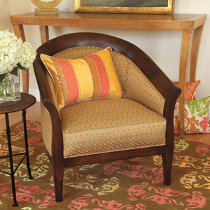
Neutral colors are an important option when selecting home furnishings.
Color plays a key role in triggering our nostalgia.
Color plays a key role in triggering our nostalgia.
How Color Trends Are Determined
“Design and color trends are not conjured up in a crystal ball—they are the result of much observation of the surrounding natural world, as well as the influences that will impact the world of the future,” according to Leatrice Eiseman, executive director of the Pantone Color Institute, the authority that establishes color directions for industries from apparel to automobiles, and home furnishings, of course.
Influences such as social issues, the economy, lifestyles and play styles point color directions for today. Jackie Jordan, director of color marketing for Sherwin-Williams echoes Eiseman’s observations, “In uncertain times, we find comfort in the memories and traditions that provide us with a sense of solid ground. Color plays a key role in triggering our nostalgia.”
The past also figures prominently in Kelly-Moore Paint Company’s current color selections. Color stylist Mary Lawlor turned to architectural styles of the West for a range of colors spanning the mid-1890s to 1960.
-
Compelling Color Trends
Explore the color forecasts for 2010 from Pantone, Sherwin-Williams and Kelly-Moore.
- by Barbara Weathers
You may not be conscious of the fact, but color is frequently the deciding factor that compels you to buy a particular piece of furniture or decorative art for your home.
Palettes for 2010 are especially appealing and compelling. Rooted in a more serene and secure past, they reflect your current concerns, and focus on quiet interior landscapes enlivened with bold color accents.
Without question, the economy and everyone’s preoccupation with preserving their homes, lifestyles and family harmony have influenced this year’s choices by professional color arbiters.
Pantone Color Picks for 2010
To find the colors in the forefront of fashion, Pantone Color Institute’s Leatrice Eiseman and her team travel around the globe. Their scouting trips for 2010 resulted in four distinctive directions they are calling Ambiance, Gatherings, High Definition and Tinged Neutrals.
Ambiance
Coffee Bean, Cognac, Stonewash Blue, Silver Pink, Stucco, Desert Sage, Griffin, Brindle, Fog
Pantone’s Ambience palette is sophisticated, yet understated. Rich Coffee Bean and Cognac are central to the color theme subtly complimented by shades of Stonewash Blue, Stucco, Desert Sage, Silver Pink, a taupe-cast Brindle and two shades of gray.

Gatherings
Copper Coin, Lemon Curry, Lion, Smoke Blue, Cypress Green, Sand, Oasis, Twilight Mauve
Colors in the Gatherings palette are inspired primarily by the continent of Africa and were selected to reflect its vastness and complexities of landscape and culture. Taking their cue from the creative boldness of the continent’s artifacts and handicrafts are Cypress Green, Smoke Blue, Sand, Oasis, mixed with the quietness of Twilight Mauve, the piquancy of Lemon Curry and the glimmer of Copper Coin.

High Definition
Silver, Steeple Gray, Old Gold, Peat, Amaranth Purple, Paisley Purple, Malaga Wine, Ibis Rose, Blanc de Blanc
High Definition is both classic and modern in concept. Black, white and gray are the timeless centerpieces enriched by the dramatic hues of Amaranth and Paisley Purple, Malaga Wine and Ibis Rose and infused with the glitter of Old Gold and shiny Silver.


Tinged Neutrals
Neutrals, especially grays, are an important part of the decision-making process when selecting home furnishings and Pantone has put together a selection that is considered most directional. The neutrals are tinged with green or blue and there is a classic white along with Champagne Beige punched up with a tinge of luster. Included with these tones are some of the most directional accent colors selected from the “Ambiance,” “Gatherings” and “High Definition” palettes.

Sherwin-Williams Top Choices for the Year
Sherwin-Williams takes cues from the past to paint the way to the future. “In uncertain times, we find comfort in the memories and traditions that provide us with a sense of solid ground,” says Jackie Jordan, director of color marketing, for the company. “Color pays a key role in triggering our nostalgia, and our trend forecast reflects the re-discovery of the sights, sounds, smells and colors of the past.”
The 24 shades selected by Sherwin-Williams color experts for the 2010 color mix are grouped into four collections: “Rooted,” “Treasured,” “Simplified” and “Refreshed.”
Rooted
Nomadic Desert, Rockwood Amber, Foothills, Red Tomato, Oceanside, Darkroom
The color re-discovery begins with inspiration from the world’s oldest, most enduring civilizations, including the rich, dynamic colors of aboriginals, Africans and Native Americans.
Infused with the artistry of cultural artifacts such as animal print fabrics and wooden musical instruments, the ‘Rooted’ palette mixes the natural with the bold and vibrant. Neutral tones include the earthy Nomadic Desert, Rockwood Amber and Foothills. These colors are brought to life with saturated tones of spicy Red Tomato, Oceanside, and Darkroom, a blackened purple reflecting the mystery and mystique of the cultures at the heart of the collection.

Treasured
Caribbean Coral, Interactive Cream, Sequin, Smokey Blue, Sturdy Brown, Gallery Green
The time-tested shades of the Treasured collection evoke the warm, comforting memories of beautiful heirlooms of times past.
Many of the colors are muted shades of brighter tones. Caribbean Coral, for example, is a softer, retro alternative to the vibrant hue that maintains its popularity in design. Interactive Cream provides a neutral without too much flash, and yellowed Sequin adds a glow to the mix.
The darker side of the palette begins with Smokey Blue, layered with shades of gray and indigo that mirror the deep stories of our past. Sturdy Brown brings in the beauty of old, hand-made artisan crafts and the faded verdigris of Gallery Green adds a touch of antiquity with its emerald tone.

Simplified
Whitetail, Butter Up, Moderate White, Magnetic Gray, Serious Gray, Enigma,
This collection stays true to its name with colors that, when combined, create a sophisticated style that embodies a "less is the new more" spirit.
Translucency connects the colors in this collection, providing versatility to any space with shades that change and shift in the light. Paired with transparent fabrics and finishes, clarity, subtlety and serenity are apparent in every hue.
The Simplified collection offers a palette with just a small dash of color. The neutral tones of Whitetail, Butter Up and Moderate White make up the foundation, and gray also plays an important role, with the mid-tone Magnetic Gray and darker Serious Gray. The muted lilac shade of Enigma offers an intriguing accent well-suited for this sophisticated palette.

Refreshed
Sapphire, Verve Violet, Fun Yellow, Pickle, Animated Coral, Summer Day
The Refreshed collection features vibrant and forward colors to evoke a sense of optimism for the future. "The exuberant shades of ‘Refreshed’ enliven the spirit and turn our focus to more carefree days,” Jordan says. “While not as saturated as some accent colors of collections past, these hues still reflect the optimism that can always be found within us, even as we navigate challenging times."
Fresh florals, sunny days and tropical blooms are the inspiration behind this collection. Sapphire and Verve Violet are reminiscent of a botanical garden, and Fun Yellow mimics sunshine. Pickle along with the grapefruit and tangerine tones of Animated Coral and Summer Day, also add fun flavor to this palette.
Together, the vivid hues of the Refreshed collection create a lively, harmonious palette to offset the darker realities of today’s uncertain times. What’s more, when added individually to another collection, these colors can offer a bright reminder of better days to come.

Kelly-Moore Picks Palettes from the Past
A new approach to color selection was pioneered by Kelly-More Paint Company. Color stylist Mary Lawlor delved into our nation’s vibrant Western history spanning 110 years of six architectural styles—Victorian, English Revival, Spanish Revival, Arts and Crafts, Jazz Age and Retro.
Lawlor explains her motivation: “Over time, Western color choices became noticeably distinct and more colorful than those of Eastern homeowners. Very soon they became aspirational color choices for the rest of the country. These interesting differences inspired us to develop the ‘Historic Lifestyles of the West’ color palette for our customers wanting to create an historic or contemporary look using historical colors.”
Victorian (1850 -1900)
Representing new status and wealth, Victorian homes were ornately decorated, sometimes with dozens of colors. Even though the architecture was global, colors were not and may were still muted.
English Revival (1890-1940)
English Revival homes mimicked the style of the English countryside. The design objective was to look as old and rustic as possible, as the colors suggest.
Spanish Revival (1890–1940)
This style drew inspiration from Spanish and Mexican architecture. Stucco exteriors were painted with whites and browns while interiors were fashionably brighter, following period trends.
Arts and Crafts (1910-1940)
Arts and Crafts has been the most replicated style over the last decade in the new home market. These versatile modern homes usually remain true to their authentic color roots.
Jazz Age (1915-1940)
A mixture of Colonial, English, and Arts and Crafts architecture, Jazz Age homes were small with light exteriors such as off-whites, grays and greens, and strikingly bright interiors.
Retro (1930-1960)
Built in an era synonymous with corner windows and the newly attached garage, these ranch homes all had modern amenities. Exteriors were simple and interiors showcased vibrant colors as well as chrome and glass.
There you have it: A compelling color story for 2010 from three perspectives.